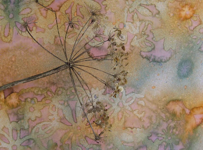
i had made some backgrounds recently, spraying with various glimmer mists and some stencils (here: felt flower borders)
from my walk on monday i had brought some umbels and made some photographs with these on the backgrounds (more to come in a later post – when i will have more time…)
 now when i read about the new crusade i thought i could perfectly use these backgrounds…
printed it out twice (about a-5-size).
 on the first copy i started taking the umbel as a base to write… then i took a pink neocolor II and wrote some more text over the page.
stamped the circles (paperbag studios) and lines (gpp), then the insect image on vellum and fixed it on the page with staples and green masking tape (teared at both sides). i LOVE these masking tapes!!
added the faux postage pic and a cancellation stamp. an old text strip in light blue was glued on and edged with neocolor II. another neocolor II for edging the whole page – done!
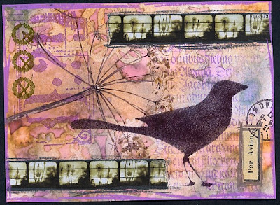
 on the second copy i started stenciling a black crow with an inkpad and a sponge. some stamps added on background. found some weed pictures which i printed in small rows on old ledger paper. glued on air mail label – plus cancellation stamp.
again final edging of everything with neocolor II in according colors. seems i can´t live without them;)
which one do you like better??
are they really different?? seems it´s hard for me to step outside my comfort zone;)
anyway, thanks michelle for the challenge. might do more…

johanna! thanks for coming to play with us again! love both of these – cool how you followed the lines of the plant for your writing in the first one. and love the repetition of images in the filmstrip effect on the second (and love the crow!). fun to see how you altered the background two ways. thanks for sharing with the team!!
Hallo Johanna,
die sind einfach klasse! Mir gefallen beide gut aber das mit dem Vogel mag ich noch ein bisschen lieber als das andere. Die Minifotos in Reihe sind toll. Das muss ich auch noch lernen, wie man sowas macht. Liebe Grüße – Svenja
Die Hintergrundentstehung ist klasse – super Idee, wär ich nie drauf gekommen. Beide Werke sind schön, mein persönlicher Favorit ist die erste Karte, mir gefällt dort besonders gut, wie du die Zweige als Linien genommen hast.
OOOOOOOOOOOOOOOOOOOOOOOOOHHHHHHHHHHHHHHHHHHHHHHH!!! Wie schööön!!! Diese wunder-, wunderschönen Farben!!! Bin so etwas von begeistert, es gab hier gerade einen tiefen Seufzer der Freude über diese beiden Karten. Es sind beide klasse, aber die 2. gefällt mir sooooo gut, dass ich mir jetzt verzweifelt überlege, was ich Dir für eine Villa in Starnberg dafür bieten müßte ))
))
what a beautiful background! and i love the addition of that fabulous green in the top one! great job!
these are wonderful. love that crow!
Huhu Johanna, mein Englisch ist zwar mehr als Bescheiden, aber zumindest habe ich rausgelesen, das Du wissen willst welche Karte uns besser gefällt.
Ich find ja beide superschön, aber wie die meisten hier,finde ich die mit dem Vogel einen ticken schöner.
They are both so beautiful ! You had a wonderful background to start with, and managed to do two different pages of which I love the second one a bit more, but of course that is a personal thing Well done, can’t wait to start with this challenge myself !
I love both renditions, please don’t make me choose…:))
Boah, die sind beide fantastisch, Johanna! Wenn ich aber unbedingt wählen müsste, dann würde ich mich für die mit den Insekten entscheiden. Du siehst: Geschmäcker sind eben doch (und Gott sei Dank) verschieden.
Ein schönes WE wünsche ich Dir!
LG
MARTINA
I like them all – first and especially the third are my faves though. Such lovely details, colors and composition. Thanks for the inspiration!
Lovely pages. They are both great but I think I like the second one (with the crow) better because it seems less cluttered. Not that it’s a bad thing…
Sophie
Johanne, these are so beautiful and so effective! Love how you hav eused the plant!
Hi Johanna, in answer to your question, I have two plastic stencils of people – one men, the other women. I found them in a stationers.
Thanks for visiting.
Both pages are lovely. I think I prefer the second one because I just love the wee rows of weeds you printed out.
Lovely, Johanna!
Beautiful work! It’s lovely to see how different and similar something can turn out with the same backgroudn!
Absouletly AMAZING pages. Just love the colours..so pretty.
I’ve got my backgrounds printed today so can’t wait to start!
Happy crafting, Gez.
I adore the crow one! I have a strip of repeated images that has been hanging around on my table for ages, just waiting to be used. Your 2nd page with the repeated design in a strip is gorgeous and a great inspiration for how to use mine.
Beautiful !! I realy love it.
Especially all those details.
These are great! I love the colors and I love the one with the crow.
Both pages are beautiful, but I really like the crow with the stamps on the background.
These are both beautiful, it’s hard to choose! I like the big round stamps in the 1st one, but also the long skinny film strips in the 2nd one. It’s fun seeing what all the artists do during the crusades! happy creations from germany, tj
I love both of these and it’s really hard to choose but I think the first one is my favourite with its delicate images. Thanks for sharing.
Beautiful, beautiful images. So delicate but still so much to look at.
The original was beautiful on it’s own. Both variations are very nice, but since you asked… I prefer the bird. I like birds and it makes a strong focal point on the page.
These are both beautiful. I think I especially love your color palette. Soothing, exciting and interesting all at the same time. Very cool!
I love your work…. very enchanting!