edit: ich habe eine umfrage rechts oben eingefügt: ihr könnt mir helfen bei einer entscheidungsfindung bzgl meines blogs: hintergrund schwarz lassen / auf hellen hintergrund stellen / ist mir egal. — bitte stimmt ab ![]()
please regard my poll on the top of the sidebar…
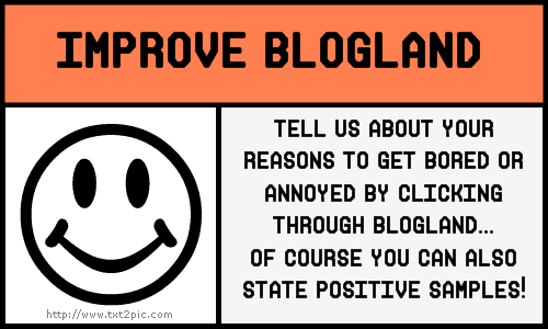
but over the time there are some little things which frequently annoy me when i make my travel through blogland. i tried to name these things and i´m posting a few samples here. if you like, you can copy the sign i made and tell about your little annoyances in blogland. it is NOT meant to name or pick out certain blogs and be unfriendly!!
but i think we all could need some thoughts to improve some little things… and it would be great if you leave a comment here, tell us your opinion and/or link us to your blog…
ich blogge jetzt seit über 4 jahren und genieße es unvermindert! so viele leute hab ich “kennengelernt”, von nah und fern (viele werde ich nie persönlich treffen), ich liebe diesen austausch! es ist eine absolut positive erfahrung, die ich nicht missen möchte.
trotzdem fallen mir über die zeit hinweg immer ein paar kleinigkeiten auf, die mich stören wenn ich mich durch die blogs klicke. manchmal führen diese einfach dazu, dass ich keine lust habe, auf dem jeweiligen blog zu bleiben – und ich hab jetzt mal versucht, ein paar dieser dinge zu benennen. ich hab ein zeichen dafür entworfen, das ihr euch gerne kopieren könnt, falls ihr auch über verbesserungen posten wollt. es ist NICHT dazu gedacht, bestimmte blogs zu benennen und zu jemandem unfreundlich zu sein! aber es gibt vielleicht auch etwas, das euch stört… und dann wär´s ja gut, das mal allgemein auszusprechen.
falls ihr dazu lust habt: bitte hinterlasst hier einen kommentar, damit wir evtl. auch bei euch vorbei schauen können…
so, what i don´t love:
- if the blog is hard to read: very special colors on certain backgrounds are hurting the eye. the text is hard to read and i get tired of it very soon. (same of course for too small sizes of text…)
- “noisy” sidebars: there are some features who create a constant movement… f.e. a certain kind-of-slideshow, which pretends to be an old film (with scratchy vertical stripes) and always hops when the next pic is “falling down” – and which in itself looks really good – BUT: i hate it to be constantly distracted from the text on the blog i want to read. it is getting on my nerves and i will leave the blog.
- too long breaks between posts… well, this is a somehow two-sided thing: i can totally understand there are times of lacking muse, too little time for creating because other things are more important &&&… of course one should not feel forced to post (and there is the b.w.o. sign on some blogs… “blogging without obligation”). that´s fine. but to tell the truth: i soon will lose track of these… i simply forget to visit them after a while of constant neglection… — better: if you know it before, tell people you will be away for awhile (holidays or whatever)
- too many posts on one page: you can edit the blog to a certain amount of posts per page… you can visit the older posts by clicking a button at the bottom of the page. the more posts you show on one page, the longer the time to load (some blogs have hundred and more pics to be loaded). MY computer does not do this in a few seconds… and sometimes i´m just tempted to click away… i don´t want to spend my time waiting… — i personally have the ten recent posts on my main site… i think this is enough as i seldom get comments on the ones at the bottom – so i suppose they are just no longer visited very often…
- there are other features that slow down the loading of a page, but i can´t name them for sure (as i´m a computer idiot…). but i THINK it are features like moving some little pictures with your mouse (a little fairy for example follows the cursor where ever you move it… – and well, i think it is funny in the first moment, but i get tired of it quite soon…) or something like this. maybe some add-ons in the sidebar… don´t know (idiot, as said;))
- wenn man den text schlecht lesen kann: bestimmte farben auf bestimmten hintergründen tun den augen weh. dann ist es zu anstrengend, die augen ermüden sehr schnell (gilt natürlich auch für sehr kleine schriftgrößen)
- “lärmende” seitenelemente: damit meine ich nicht irgendwelche geräusche (kann man ja abschalten), sondern z.b. hüpfende bilder-shows… es gibt da eine diashow, die ich zwar optisch sehr schön finde: sie stellt eine art “alten film” (mit vertikalen kratzern) dar, aaaaber: die neu erscheinenden bilder hoppeln dauernd nach… das lenkt mich total ab vom eigentlichen aktuellen text, den ich auf dem blog lesen will. das geht mir manchmal so auf den geist, dass ich wegklicke…
- zu lange pausen zwischen den posts… nun ist das zwar eine zweischneidige sache: ich verstehe vollkommen, dass das leben nicht nur aus bloggen besteht, vieles andere ist wichtiger; auch fehlt einem manchmal die muse, man hat eine kreative pause, alles o.k…. man soll sich schließlich nicht zum bloggen gezwungen sehen. aber trotzdem: ich verlier solche vernachlässigten blogs schnell aus den augen – ich vergesse dann einfach, wieder vorbeizuschauen… wenn man vorher weiß, dass man eine weile weg ist (urlaub etc), besser darauf hinweisen.
- zu viele posts auf einer seite: man kann ja einstellen, wie viele posts pro seite angezeigt werden sollen… und wer dann noch ältere sehen will, kann unten auf der seite das entsprechend anklicken. je mehr posts auf einer seite gezeigt werden, desto länger dauert das laden der seite (es gibt blogs mit hundert und mehr bildern, die sich erst mal aufbauen müssen…). MEIN computer macht das nicht mal eben in wenigen sekunden… und manchmal dauert mir das einfach zu lange und ich klicke wieder weg, weil ich meine zeit nicht mit warten verbringen will. — ich bin sicher nicht das maß der dinge, aber ich hab meinen blog auf anzeigen der letzten 10 posts gestellt, ich denke das reicht. selten bekomme ich noch kommentare zu den einträgen unten auf der seite, also werden sie wohl nicht mehr sehr stark besucht sein (und wer will, kann ja immer noch auf “ältere posts” klicken…)
- es gibt noch andere dinge, die den aufbau einer seite ziemlich verlangsamen, die ich (als computeridiotin) aber leider nicht genau benennen kann… ich vermute es sind z.b. so spielereien wie irgendwelche figuren, die ständig der maus folgen (bsp: bewegt man den cursor, fliegt ständig eine kleine fee mit – das ist im ersten moment vielleicht ganz witzig, nervt mich aber ziemlich schnell…). bestimmt gibt´s da auch noch andere features im seitenstreifen, die ziemlich bremsen können, aber da kenn ich mich zu wenig aus (ich sag ja, compi-doof…;))